
How Enjoy Illinois Built a Trade Show Booth That Welcomed the World at IPW
Client: Illinois Office of Tourism (Enjoy Illinois) | Show: IPW, McCormick Place, Chicago, IL | Footprint: 40’x50′ Island Exhibit + 7 Partner Inline Booths
Illinois is more than one thing. The booth had to prove it.
For years, Illinois tourism leaned on its most familiar shorthand. Route 66. Springfield. The nod to Chicago’s skyline. Those aren’t wrong directions to take, but for an international audience of travel buyers building itineraries at IPW, they don’t tell the full story. And a trade show booth that doesn’t tell the full story leaves opportunity on the floor.
The Illinois Office of Tourism came to IPW with a different mandate: build a presence that reflected the breadth and modernity of the state, welcomed a global audience, and could credibly compete with the kind of statement-level trade show booths that host cities were bringing to the floor.
The brief called for a deliberate shift — from rustic and nostalgic toward clean, modern, and internationally legible. From a single iconic road to an entire state worth exploring. From a trade show booth that featured Illinois to one that embodied it.
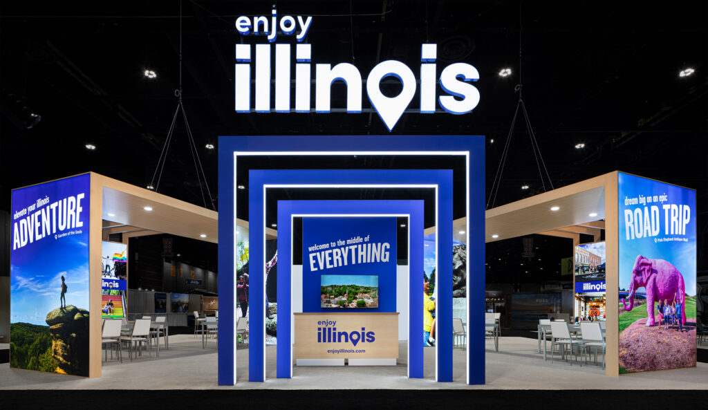
The booth had one job: make Illinois feel modern without making it feel unfamiliar.
The brief named the shift precisely: away from rustic, toward modern. Away from heavy materials and nostalgic visual shorthand, toward clean lines, light-filled structures, and surfaces that read as premium to an international audience. The “Enjoy Illinois” identity was the lead with everything else organized around it. Modern doesn’t mean cold. Inviting doesn’t mean generic. The creative direction had to thread that needle across every surface, every finish, and every graphic panel in a 2,000 square foot footprint — and hold that tone across multiple partner booths simultaneously.
“Modern, inviting, and welcoming” — that was the direction. We designed backward from that feeling, not forward from a materials list.
The material choices were where the strategy became tangible. Anodized aluminum and wood-look vinyl gave the booth a warm-modern quality that felt durable and intentional rather than temporary. Chrome laminate on the entry archway. Milk acrylic on the dimensional logo. Wood-look laminate panels on the U-shaped canopy structures. These were decisions about how Illinois wanted to be perceived by a buyer who had never been to the Midwest and was deciding whether to send their clients there.
Every image selected for the booth was chosen for international appeal — experiences that translate across cultures and register as aspirational rather than regional. The booth needed to feel like an invitation to a state with a lot to offer. It left no doubt that it does.
A 40×50 trade show booth covers a lot of intentionally designed space.
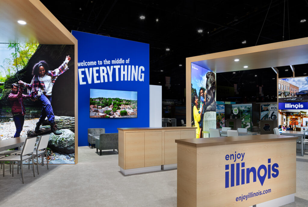
Every square foot had a job. So did every inch of ceiling.
The entry earned the “wow” before anything else did.
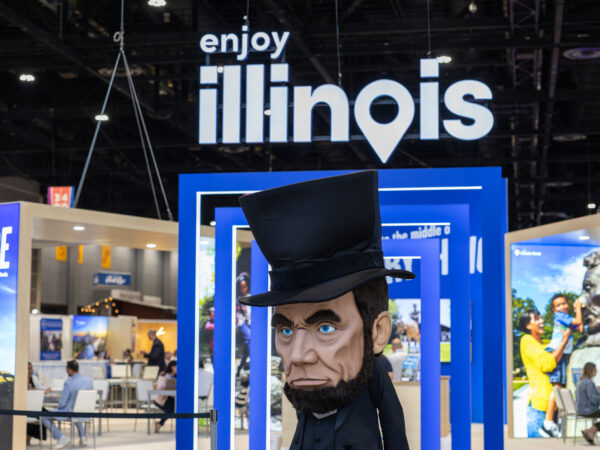
The brief specifically called for a “statement” entrance that could compete with the energy of major host city exhibits on the same floor. We built a custom illuminated archway — 12’6″ wide and 12 feet tall, finished in chrome laminate and milk acrylic — that created an immediate shift in atmosphere the moment you stepped through it. Internally lit on every edge, it turned the entry from a threshold into a moment. Buyers who walked through it knew they’d arrived somewhere worth their time before they’d seen anything else.
The hanging sign was the first thing you saw from the aisle.
Overhead, a three-dimensional illuminated “enjoy illinois” hanging sign — 11’5″ wide and 5’6″ tall — spelled out the state’s identity in metal-framed letters with LED-lit milk acrylic fronts. This wasn’t a fabric banner or a printed graphic. It was a physical object with presence, dimensional and lit, readable from the far end of the aisle and credible up close. Two quarter-ton chain hoist motors handled the rigging for both the overhead truss and the logo — engineered to spec and reviewed for safety against the 2019 Chicago Building Code for temporary structures.
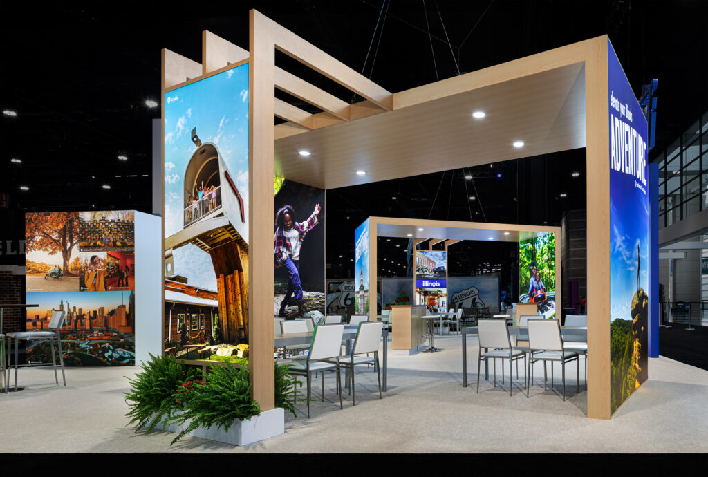
The canopy structures defined the space without closing it off.
Large U-shaped canopy structures with wood-look laminate panels and integrated can lights created distinct zones within the open island footprint. They gave the booth architectural depth — a sense of rooms and transitions — without walling anything off. The overhead warmth of the can lighting pulled the space together and gave it a quality that trade show booths rarely achieve: it felt like somewhere, not just something.
Twelve meeting rooms ran at full capacity. Nobody noticed.
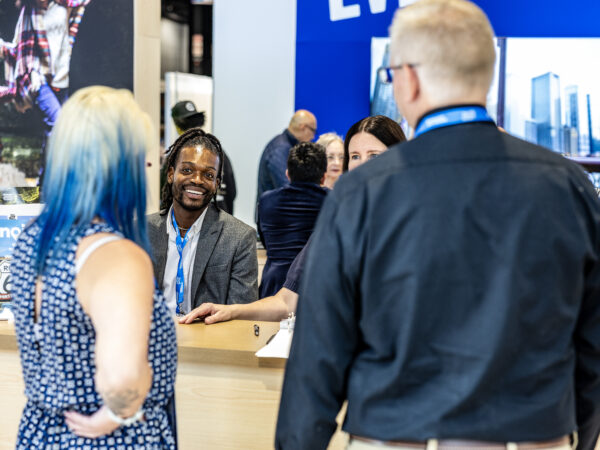
Six semi-private meeting spaces for up to four people each were built into the footprint alongside the full public activation experience. A central check-in desk with a direct sightline to all meeting entries managed the flow. A separate hospitality and beverage station kept the energy social without pulling the business side of the booth off-task. The brief asked for 40-plus pre-scheduled business appointments per day. The layout was built to absorb that volume without the booth ever feeling like a waiting room.
The activation zone was built to travel.
Dedicated activation areas with interactive kiosks and branded touchpoints were positioned to drive organic social content without competing with the meeting flow. A 98″ monitor at the Brand ID Tower ran state content continuously. LED-integrated archways, LED lightboxes, and LED toe-kick lighting on the counters gave the space a polish that showed up clearly in every photo taken inside it — which was the point. The booth was designed to generate content that international buyers would carry back to their home markets. That reach doesn’t appear in a meeting count. It compounds for months afterward.
Seven partner booths felt like one state.
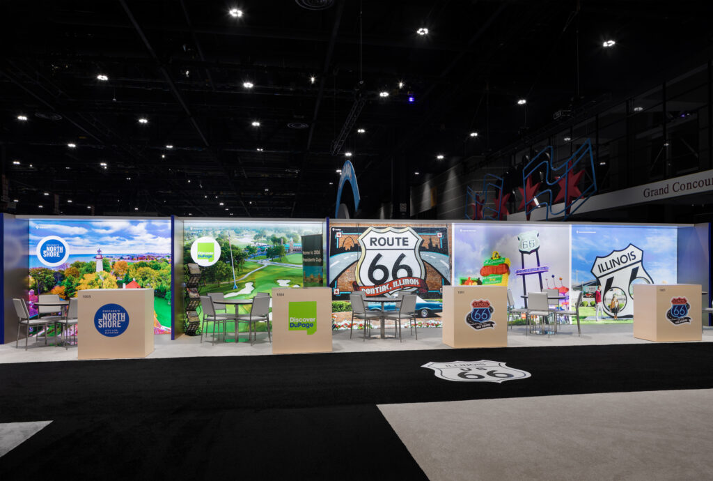
Six 10×10 and one 10×30 modular rental units extended the Enjoy Illinois visual identity through the surrounding aisles. Built on BeMatrix b62 frames with backlit SEG fabric graphics and shared design DNA from the main booth, each partner location had its own presence within a coordinated system. From a distance, it read as a unified state. Up close, each partner had room to tell their own story. That balance — coherence at scale without uniformity — only works when the system is designed before the individual units are.
Illinois came as a state. It left as a destination.
The entry archway delivered the “wow” the brief asked for. Buyers who walked through it didn’t need to be told they’d arrived somewhere worth their time. The dimensional sign overhead made the booth findable from anywhere in the aisle. The canopy structures gave the interior architectural character that most trade show booths never achieve. The meeting rooms ran at capacity. The activation zone generated the kind of organic content a state tourism office can’t buy with a media budget.
A trade show booth for a destination isn’t selling a product. It’s selling a decision. The experience has to make that decision feel easy.
The shift from rustic to modern read clearly on the floor. The material choices — anodized aluminum, wood-look vinyl, chrome laminate, wood-look canopy panels — gave the booth a warmth and permanence that set it apart from exhibitors who were still working with older visual frameworks. International buyers responded to the aesthetic before they responded to the content.
Behind all of it: 14,442 pounds of property across 15 custom units spanning 2,936 cubic feet, shipped June 6, 2025. A full crew managed by FGPG’s install and dismantle leads from June 11 through June 20. Every structural element — including the rigged overhead elements — reviewed and approved for compliance before a single panel went up. The execution was as considered as the design. At a show like IPW, one without the other isn’t enough.
A state. A story. A trade show booth built to carry both.
Destination marketing is one of the most nuanced briefs in experiential design — you’re not selling a product, you’re selling a place. FGPG brings the strategic clarity and fabrication capability to make that story land on any show floor, at any scale.
Let’s talk about your next show.
-
How did FGPG differentiate Enjoy Illinois from other destination trade show booths on the same floor?
The creative direction made a deliberate shift from rustic and regionally familiar toward modern, clean, and internationally legible. Imagery was selected for international priority hooks rather than domestic recognition. Architectural choices like chrome laminate, milk acrylic, and backlit SEG fabric moved the visual identity toward a premium, inviting aesthetic that resonated with buyers from markets across the globe, not just those who already knew the state.
-
How were seven partner booths kept visually consistent with the main exhibit?
-
Can FGPG design trade show booths for state tourism and destination marketing clients?